Monday, May 29, 2006

Anime Clay


This is my first try at drawing in a Manga style. It is much more difficult than it looks. My hat is off to people who do this all the time. It is a fun style.

Related Tags: , , , ,

Friday, May 26, 2006

Clay portrait

Still humming "Clay Aiken on my mind". I just finished this portrait of him from the AI5 finale. I did it in Adobe Illustrator. It is clickable.

Thursday, May 25, 2006

Blown away

I have only watched American Idol a wee bit this year but when we heard the rumor that Clay might be there, I really wanted to watch it. But on tv it was up against the first game of the Mavs/Suns series and do you think I was going to get the big TV??? Of course not. I didn't even ask. So my 14 year old son had to put with me watching his little 13 inch tv in his room. But even on a 13 inch TV Clay looked so good. I really like the new hair. I like it so much I made a wallpaper.

Monday, May 22, 2006


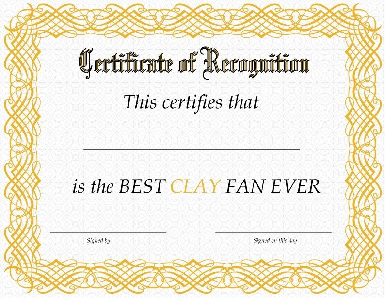
Do you have a friend who is crazy about Clay Aiken? Looking for a unique gift for them? I just created this certificate in Illustrator. You can download the PDF version (1.3 Mg), print it, fill it in and give it to 'em. (the certificate I mean).

Enjoy!

Clay Fan Certificate


Sunday, May 21, 2006

Let's talk about fonts

I love fonts. It is amazing and wondrous to me how you can make so many variations from 26 letters and 10 numbers. They are so emotive or they can be. There are serif fonts (they have the little feet on them), san serif fonts (without the feet), display fonts (specialized to be used at large sizes and to grab attention to your headlines), script and/or handwriting fonts (can be used to give a casual, friendly feeling to your message).

There are multiple subcategories in each of these. There are also pi fonts (also called dingbats). These can be very helpful in creating a quick message. For instance, say I am creating a quick card to invite some friends to a cookout by the lake. I want my card to be friendly and casual, so I am looking for a handwritten looking font. A good place to look is DaFont. You might have to choose English or French language.

http://www.dafont.com

On their index page is a list of types of fonts. I am looking under Script/Handwritten. I start looking in the A section and right away, I see Angelina. That is exactly the look I want. So I download and unzip it. I install it in my Fonts folder. If anyone doesn't know how to do this, I will cover this next time. Continuing on, back to the index page of Dafonts.com. I look under Dingbats/Various and I find a great font called Culinary Art by GemFonts. I download that one. Then I choose one called 4YeoSummer because it has some great dings of summery things. Download and install those. Oh, there is something you can do if you don't want to install these. Once you have extracted them, you can open them with your font viewer by clicking on them,now just minimize them to your taskbar. When you open your graphics software, it will recognize them as if they had been installed.

I am going to use Macromedia/Adobe Fireworks to put this together although you could use any graphics app and probably even Word *shudders*.

Here is a quick invitation that I came up with. I used the 4YeoSummer dingbats: G for the couple under the umbrella, J for the woman on the floatie, P for the sun behind "Beach Party" and K for the boy waving on the bottom. I used Culinary Arts: B for the burger and U for the hot dog. Then I wrote the invitation in our font, Angelina.
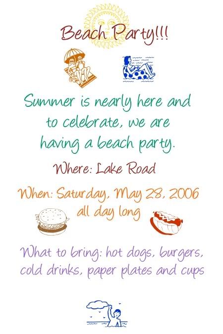


I am not espousing this as design but just wanted to show a quick and fun way to use different kinds of fonts and dings.

Wednesday, May 17, 2006

Another short one

I feel badly that I haven't blogged about anything substantive lately but at least I brought the pretty! This is a Flash movie of some pictures of Clay Aiken that I altered in Photoshop to make them Ansel Adams like dramatic black and whites.


Monday, May 15, 2006

I think about Elvis video

I have been working on a catalog front page and also making some blog templates but I wanted to try to embed video. This is a montage I made in 2004. It is pictures and video of Clay Aiken set to the song, "I Think About Elvis", by Patti Loveless. Hope you like it.

Friday, May 12, 2006

Beautiful

I wanted to do a test post using flickr.com as my image storage site of choice because they have this neat button above a picture that is public that says, "Blog this" and you click it, choose a Title and write your post. VoilĂ !

Thursday, May 11, 2006

Portfolio done

Tonight my "book" (design portfolio) was due. I have been working towards this for a long time now so it feels unreal that I have my portfolio, a resume, a website, a logobook. I guess all I need is a job.

A lot of my class waited while our professor went over our books and we were talking about what kind of work we wanted to do. It was all different but similar. When people ask me what kind of job I want, I feel hesitant to say because my favorite thing is to illustrate but I have been told that things like layout out brochures and annual reports are where the money is. So does a person apply for that sort of job or freelance doing things you really like? That is the question.

There is a group of us from school who are talking about starting our own design firm which sounds like the best of all worlds. We are all good designers and have different skill sets and we like one another and have lots of fun together.

In the middle of getting the portfolio ready, the website up, reading "Painless Algebra" so I can pass my algebra final, I did something just for fun. We will be having CD Release Parties when Clay Aiken's new album is released and there will be a poster contest at some point. There have been some less than happy times lately so I wanted something bright and festive.


It gets bigger if you click it, but put shades on first!

Wednesday, May 10, 2006

Unanswered question

My friend Maggie asked me what is the difference between a designer and an artist and I found this description in a curriculum description from NC State.

"An artist-designer is a creative practitioner and image-maker who brings form to emotions and ideas. There is, however, a difference between a traditional artist and an artist-designer: the artist-designer's visual message does not have to be personal, as they work for another, giving form to expressions or ideas of their client. In short, the artist-designer is a visual translator.

I love that definition. Thanks, Maggie! Thanks for the shoutout from The ConCLAYve also! I will start making some templates next week. *g*

Graphics in Mind

Graphics in Mind

Well, we made it. Up and running. With a little help from a Ruby on Rails guru I know. This template was done in Macromedia Fireworks and then sliced and the graphic elements added to the code. I am still going to change the font on the title. And I am trying to decide if I like where the comments item is located.

Today in Corel Painter IX class, I showed my professor my new website. He liked it a lot and was very kind to tell me that he thought I was a very good artist. We have had many discussions about the difference between being an artist and a designer since I first took Design One class from him.

I am perfectly happy to be called a designer. I know many designers who are frustrated fine artists so I can see how that could bother them but it isn't a problem for me.

Oh, and as Prof. Reece was checking out my website, he noticed that I have done a lot Clay (Aiken) centric work. He remembered my Clay love from Design One which I took in 2003. He said that he really likes Clay because of the great voice of course, but also because of the kind of person he is. Genuine and kind. Kinda like my prof.

Important stuff first

What is the most important thing about a blog? Why, how it looks, of course! So I am trying to figure out how to get my mockup turned into a blog template. If I figure it out, I will tell you how I did it. The mockup part was easy, I did that in Fireworks.